There’s something uniquely rewarding about collaborating with a local producer to bring a product to life on the shelf. As a wine label designer in Kent, we recently completed our second year working with Haynes Farm, creating a refined and tactile label that reflects both the quality of the wine and the heritage of the brand.
A Continued Partnership Built on Craft.
A Continued Partnership Built on Craft
Working with Haynes Farm for a second consecutive year allowed us to build on an already strong creative foundation. With an established visual direction in place, this year’s focus was on elevating the details. Subtle refinements in typography, layout and finish helped create a label that feels both familiar and distinctly premium.
For any wine label packaging project, consistency is key. Returning to a client means understanding what worked previously and pushing it further without losing brand recognition.
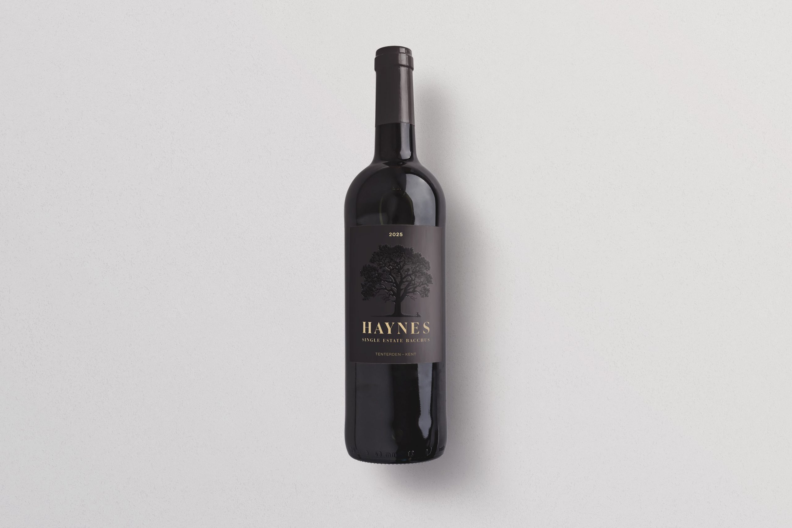
Designing for Shelf Impact
In a competitive retail and hospitality environment, a wine label has just seconds to make an impression. Our approach combined elegant design with high-end production techniques to ensure the bottle stands out.
The final label was produced using:
- Specialist textured paper to add a tactile, artisanal quality
- Foil detailing to catch the light and highlight key elements
- Spot UV finishes to introduce contrast and depth
These layered finishes create a sensory experience, encouraging customers to pick up the bottle and engage with the product.
Balancing Heritage and Modern Appeal
Haynes Farm’s identity is rooted in tradition, but the label also needed to appeal to a modern audience. As a wine label designer working across Kent and Sussex, we often strike this balance by combining classic typography with contemporary layouts and print techniques.
The result is a label that feels authentic and grounded, while still holding its own among more modern competitors.
The Importance of Material and Finish
Great wine label packaging goes beyond visual design. The choice of materials and finishes plays a crucial role in how a product is perceived. Premium paper stocks and specialist print processes signal quality before the bottle is even opened.
In this case, the combination of foil and spot UV allowed us to subtly guide the viewer’s eye, drawing attention to the vineyard name and vintage without overwhelming the design.
Supporting Local Producers in Kent and Sussex
We’re proud to support independent producers like Haynes Farm, helping them present their products at the highest level. Whether it’s a first release or a returning vintage, thoughtful design can significantly influence how a wine is received.
As a wine label designer in Kent and Sussex, our goal is always the same: to create packaging that tells a story, enhances perceived value, and ultimately helps products sell.
Looking Ahead
Building long-term relationships with clients allows for deeper creative exploration and stronger results year after year. We’re already looking forward to continuing our work with Haynes Farm and evolving their wine label packaging even further in future vintages.
If you’re a vineyard or producer looking for a wine label designer in Kent or Sussex, we’d love to help you create packaging that reflects the quality of your product and stands out on the shelf.
Leave a Comment: